1. Introduction – Why We Use Indicators
When you first open a chart, the price looks like waves rising and falling. Indicators are tools that help you read those waves. They turn raw price movements into clearer information. Think of them like magnifying glasses. Each lens shows you something different – trend, speed, volatility or volume.
Indicators do not predict the future. They describe what is happening right now. Your job is to read that description and decide what it means. In this lesson you will learn what each main indicator does and how to use it properly.
2. Moving Averages – Seeing Direction and Rhythm
Imagine you are watching price jump up and down like waves on the sea. A moving average draws a smooth line through those waves to show the overall direction. If the line is pointing up, the market is mostly buying. If it points down, the market is mostly selling.
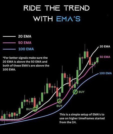
There are two main types. A simple moving average (SMA) treats every price equally. An exponential moving average (EMA) gives more importance to the latest prices so it reacts faster.
How to use it in practice:
- If price stays above the moving average line and the line is sloping up, buyers are in control.
- If price stays below and the line is sloping down, sellers are in control.
- If price keeps crossing back and forth through it, the market has no clear direction. Wait for clarity.
Best time to use: When the market is trending steadily. Moving averages struggle in sideways ranges.
How it is built: The computer adds a set of recent closing prices and divides them by how many there are. That gives one average price. Then it moves forward one candle and does the same again. The line that connects those averages is called a moving average.
Good partners: RSI for momentum and ATR for risk control.
3. Relative Strength Index (RSI) – Measuring Energy and Rest
RSI shows how strong recent buying or selling has been. It moves on a scale from zero to one hundred.
How it is built in simple words: The indicator looks at the last few candles (often fourteen). It compares how much price went up during the ups versus how much it went down during the downs. If up moves were bigger, RSI rises. If down moves were bigger, RSI falls.
Reading it:
- Above seventy means price has run up fast and may need a pause.
- Below thirty means price has fallen fast and may bounce.
- Between forty and sixty is normal resting zone.
Imagine a rubber band stretching too far – RSI tells you when the band is tight and ready to relax.
How to use it:
- If you see price rising but RSI making lower peaks, momentum is fading – a warning to tighten stops.
- If you see price falling but RSI making higher lows, selling pressure is weakening – watch for a reversal.
Best time to use: In ranges or for pullback timing inside trends.
Avoid: Selling just because RSI is above seventy. In strong trends it can stay there for days.
4. MACD – Watching Momentum Shift
MACD shows the relationship between two moving averages – one fast and one slow. It tells you when momentum is gaining or losing power.
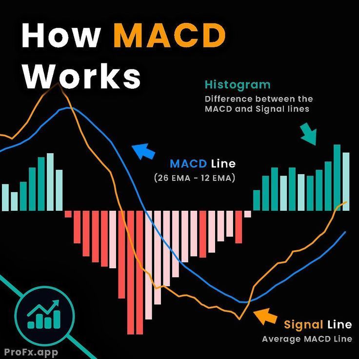
How it works: The indicator takes the difference between a twelve-period EMA and a twenty-six-period EMA. That difference is plotted as a line. Then it adds a smoother line called the signal line. When the first line crosses the signal line upwards, buyers are getting stronger. When it crosses downwards, sellers are gaining strength.
How to read it on the chart:
When the bars or histogram grow taller, momentum is accelerating. When they shrink, momentum is fading.
Use it to spot early changes in direction or to confirm trend continuation after a pause. MACD is best on one hour and four hour charts where noise is less.
Best combination: Use MACD with a moving average trend filter and volume check for stronger confirmation.
5. Bollinger Bands – Seeing Volatility
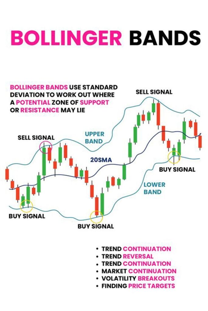
Imagine a rubber tube around price that widens when price swings hard and tightens when price slows down. That tube is Bollinger Bands.
-How it is built: The middle line is a twenty-period SMA. The top and bottom lines are drawn a certain distance above and below it based on how wildly price has been moving – that distance is called standard deviation.
-When the bands are close together the market is quiet. When they spread apart the market is active.
How to use it:
- A tight squeeze often comes before a strong move.
- In a trend price can walk along one band – do not fight it.
- If price spikes outside the band and quickly comes back in, the move was probably too fast and may reverse toward the center.
Best use: Spotting breakouts or detecting volatility changes.
Combine with volume or RSI to avoid false signals
.
6. Fibonacci Retracement – Finding Natural Pullbacks
Markets move in waves. They go up then rest, down then rest. Fibonacci shows where those rests might happen. It uses special ratios found in nature such as 38 percent and 61 percent.
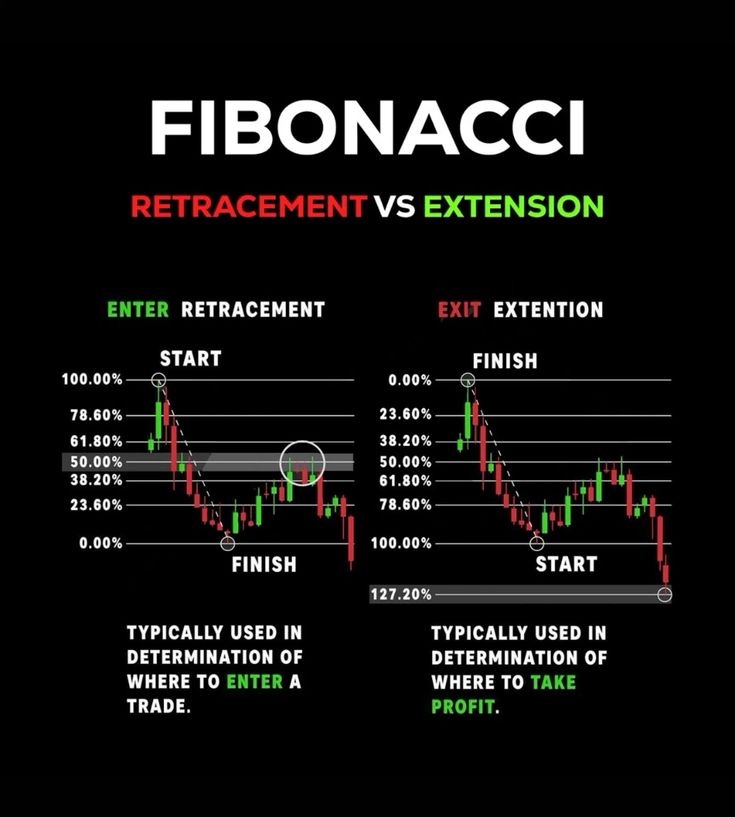
-How to draw it: In an up move click the lowest point then drag to the highest point. Lines will appear at 23, 38, 50 and 61 percent. Those are potential pullback zones where buyers might step back in. For a down move do the opposite.
-How to use it: Wait for price to pull back into one of those zones and watch for a reversal candle or RSI turn up. That shows buyers are returning.
-Best use: In clear trends where you are looking for a place to join without chasing. Do not use in messy ranges.
Combine with: Support and resistance, moving averages, and volume confirmation.
7. Volume – Confirming Participation
Volume means how many people are trading at a given moment. It is the heartbeat of the market. Price can rise on thin volume but those moves are weak. When volume rises with price, the move has real support.
How to use it:
- If price breaks a key level and volume jumps, the break is real.
- If price moves without volume, be careful. It may fade.
Common indicator: On Balance Volume (OBV) adds volume on up days and subtracts on down days. If OBV rises while price rises, the trend is healthy. If OBV falls while price rises, the trend is weakening.
Best used with: Breakout trading and Bollinger Bands.
8. Stochastic Oscillator – Timing Turns Inside Ranges
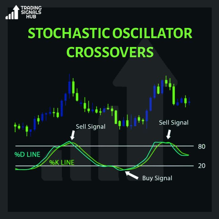
The Stochastic shows where the last close is within its recent range. If it closes near the top, buyers are strong. Near the bottom, sellers are strong.
Reading it:
-Above eighty means price has been closing near the top – possibly overheated.
-Below twenty means price has been closing near the bottom – possibly oversold
Use it to find entry points during pullbacks. When the Stochastic drops below twenty in an uptrend and then turns up, it often marks the end of the pullback.
Best used with: Trend filter like a moving average so you only take signals in the main direction.
9. Average True Range (ATR) – Knowing Risk and Room
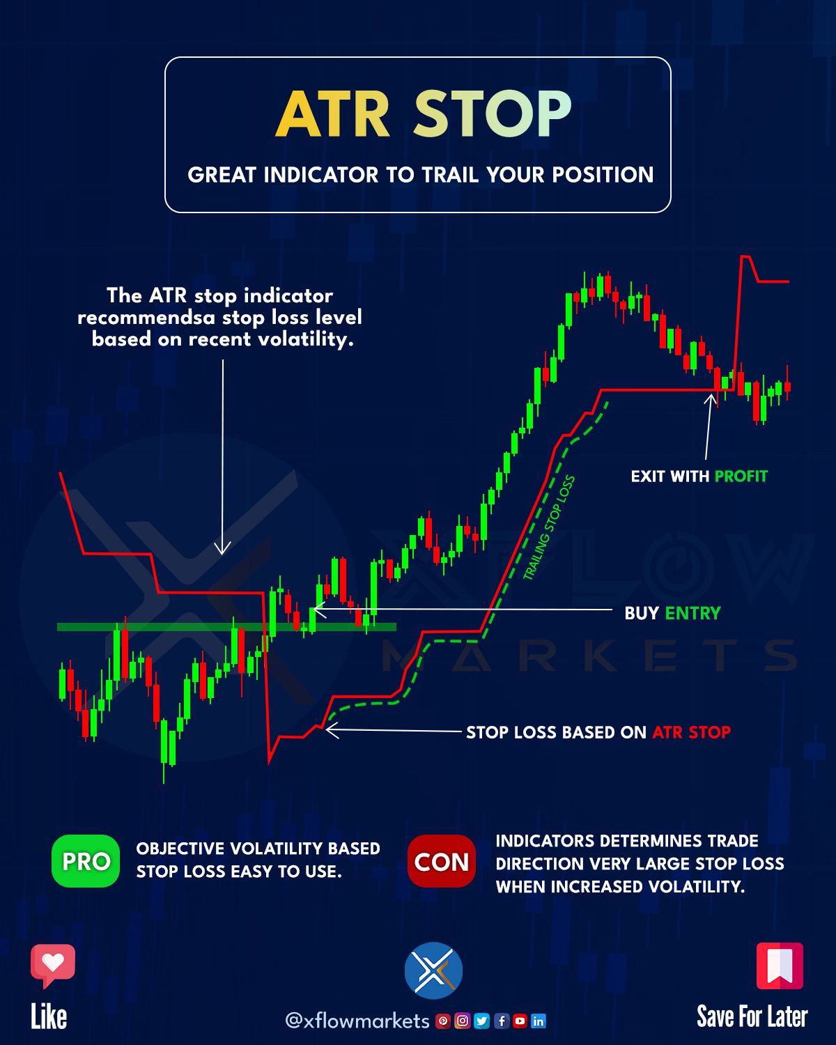
ATR measures how much price moves on average per candle. It does not say up or down – it tells you distance.
-How to use it simply: Look at the ATR number on your chart. If ATR is 50 pips, your stop should usually be at least one ATR or a bit more beyond your entry point. This prevents being stopped out by normal noise.
-Best used with: Any strategy that requires smart stop placement or position sizing.
If ATR is high, the market is active and you need wider stops. If ATR is low, the market is quiet and you can tighten stops
.
10. ADX – Measuring Trend Strength
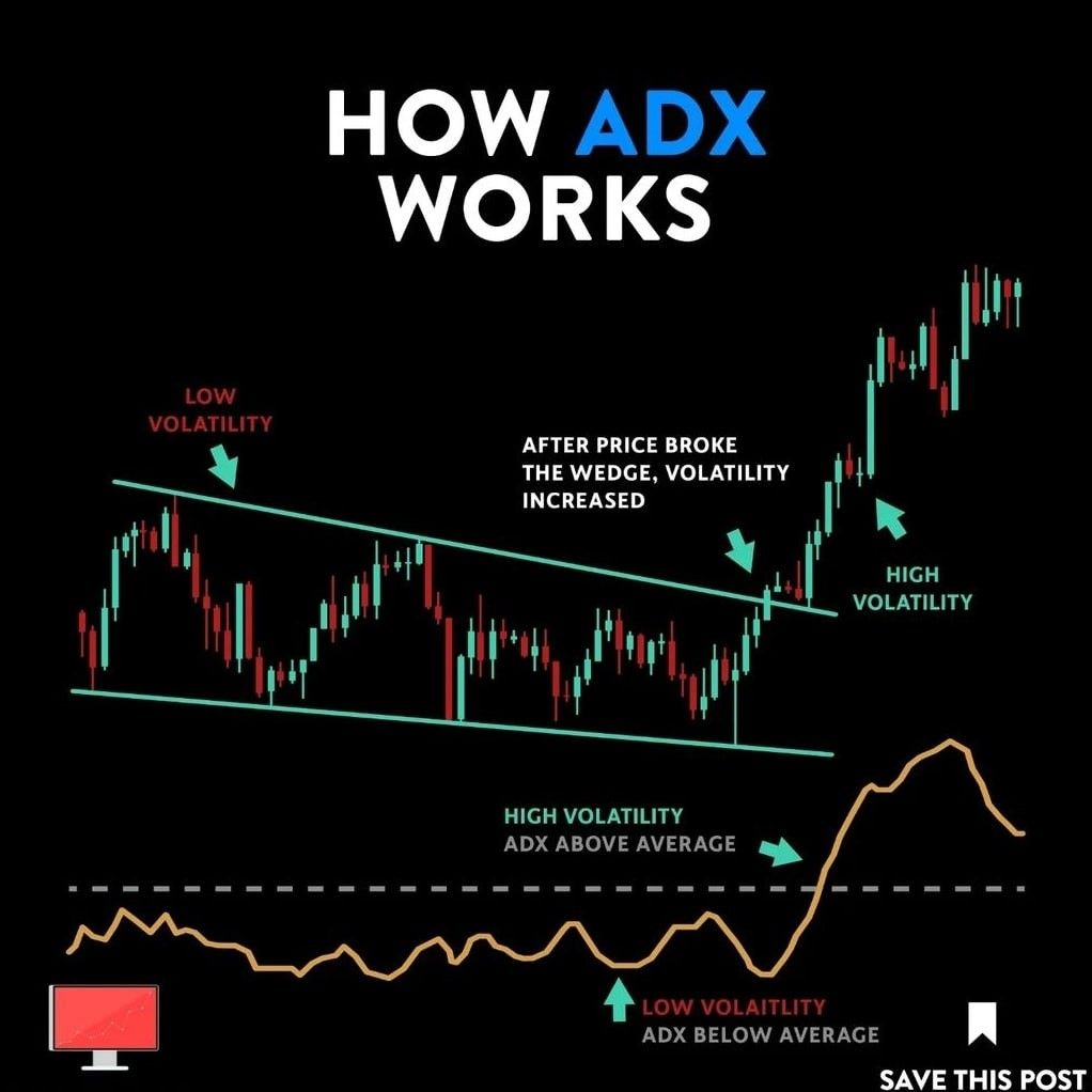
ADX tells you if a trend is strong or weak. It does not care about direction – only strength.
Readings below twenty mean the market is quiet or ranging. Readings above twenty five mean a trend is starting. Above forty means the trend is very strong and may soon need a rest.
Use it to choose strategy:
-If ADX is flat and low, use range strategies like Stochastic turns.
-If ADX is rising, use trend strategies like moving average pullbacks.
11. Putting It All Together
Now that you know each tool, you can combine them into a small system.
Example trend setup: Price is above the 50 SMA and ADX is rising above 25. RSI pulls back to 45 and turns up. ATR shows volatility of 40 pips, so you place a stop 60 pips away. This is a high probability entry in the direction of the trend.
Example range setup: Price moves sideways. ADX is below 20. Stochastic drops below 20 and turns up at support with RSI near 30. That is a low-risk bounce trade toward the top of the range.
Keep it simple. You do not need ten indicators. Three is enough. One to see trend, one to see momentum, one to manage risk.
12. Summary
Indicators translate market behavior into simple pictures. Moving Averages show direction. RSI shows energy. MACD shows momentum change. Bollinger Bands show volatility. Fibonacci shows natural pullbacks. Volume shows commitment. Stochastic shows turning points. ATR shows risk and ADX shows strength. Together they create clarity. Start small, practice one at a time, then blend them into a system that fits your personality and schedule.

