1. Introduction: Reading the Market Story
Charts are the language of the market. Every candle and line tells a story of human behavior and trading decisions.
To trade effectively you must learn to read this language and understand what price is trying to say.
A trading chart is not just numbers moving on a screen. It is the heartbeat of the market showing the balance between buyers and sellers. Each movement is a reflection of real people reacting to fear, greed, and opportunity.
In this lesson we will break down how price charts work, how to read candles, and how to identify price patterns step by step.
2. What Is a Trading Chart

A trading chart shows how price moves over time. It helps traders see past behavior and current action to make better predictions.
Charts include three main parts:
- The horizontal line shows time.
- The vertical line shows price.
- The main area displays how price changes through lines or candles.
Charts can show any time frame. You can look at price movements per minute, hour, day, or month. Short time frames reveal small moves, while higher ones reveal the main direction.
3. Types of Charts
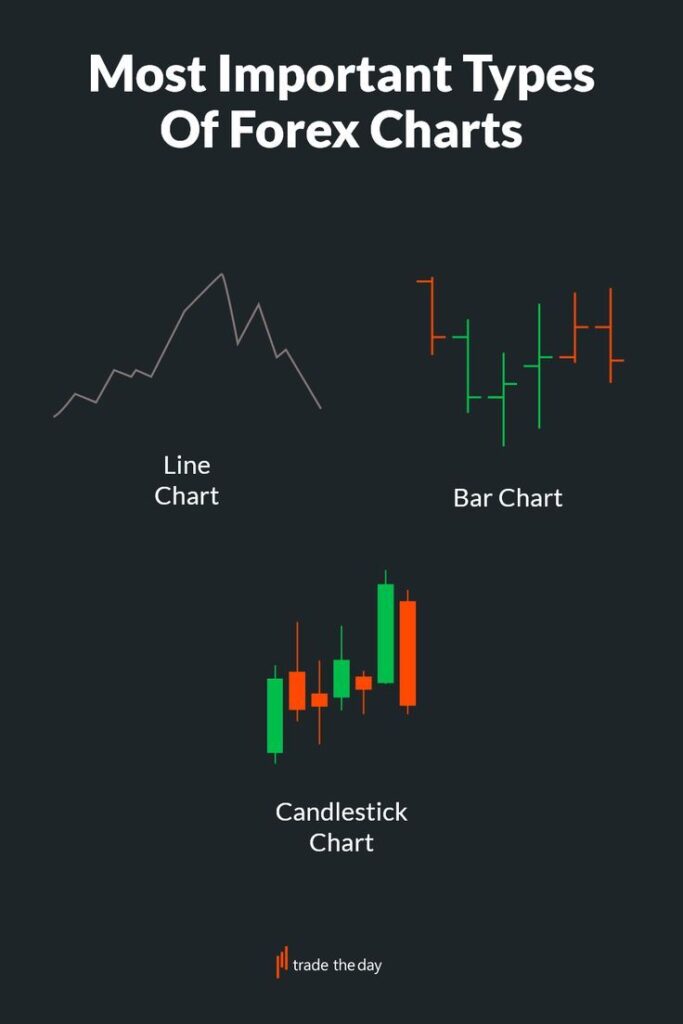
Comparison of line, bar, and candlestick charts side by side
Trading platforms give you three major types of charts. Each type shows price movement differently but contains the same information.
3.1 Line Chart
A line chart connects closing prices with a simple line. It shows the overall direction of price.
Pros: simple to read and ideal for beginners.
Cons: hides small details inside each time period.
3.2 Bar Chart
Bar charts show open, high, low, and close. Each bar is a full time period.
Pros: detailed, shows volatility and strength.
Cons: slightly harder for beginners to read.
3.3 Candlestick Chart
Candlestick charts are the most common type. Each candle shows open, high, low, and close with colored bodies.
A green or white candle means buyers dominated. A red or black candle means sellers were stronger.
Pros: visual, emotional, and easy to interpret.
Cons: can seem noisy at first.
Candlesticks form the foundation of technical analysis because they express emotion and data at the same time.
4. How Price Moves: Buyers and Sellers
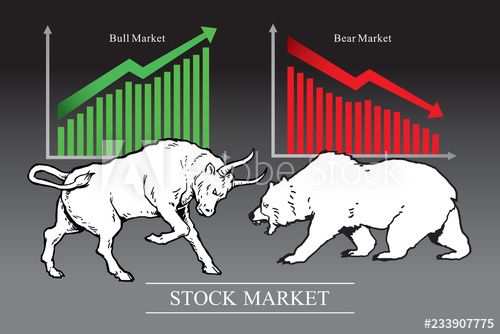
-When buyers are stronger price moves up.
-When sellers are stronger price moves down.
-When both are balanced price moves sideways.
A large green candle means buyers dominated that moment. A long red candle means sellers took control.
Learning to recognize these changes helps you see strength or weakness before it becomes obvious.
5. Time Frames and Market Perspective
Screens showing multiple charts of different time frames
Different time frames tell different parts of the story.
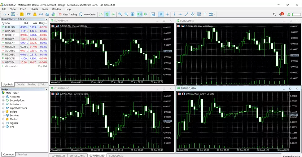
- Fifteen minute and one hour charts show intraday trends.
- Four hour and daily charts reveal medium term direction.
- One minute and five minute charts show quick short term moves.
- Weekly and monthly charts show the big picture.
Professional traders look at several time frames before entering a trade. This is called multiple time frame analysis. It helps align short term action with long term trends.
6. Candlestick Structure Explained
Diagram labeling open, high, low, and close on a candlestick
Each candle represents four price points.
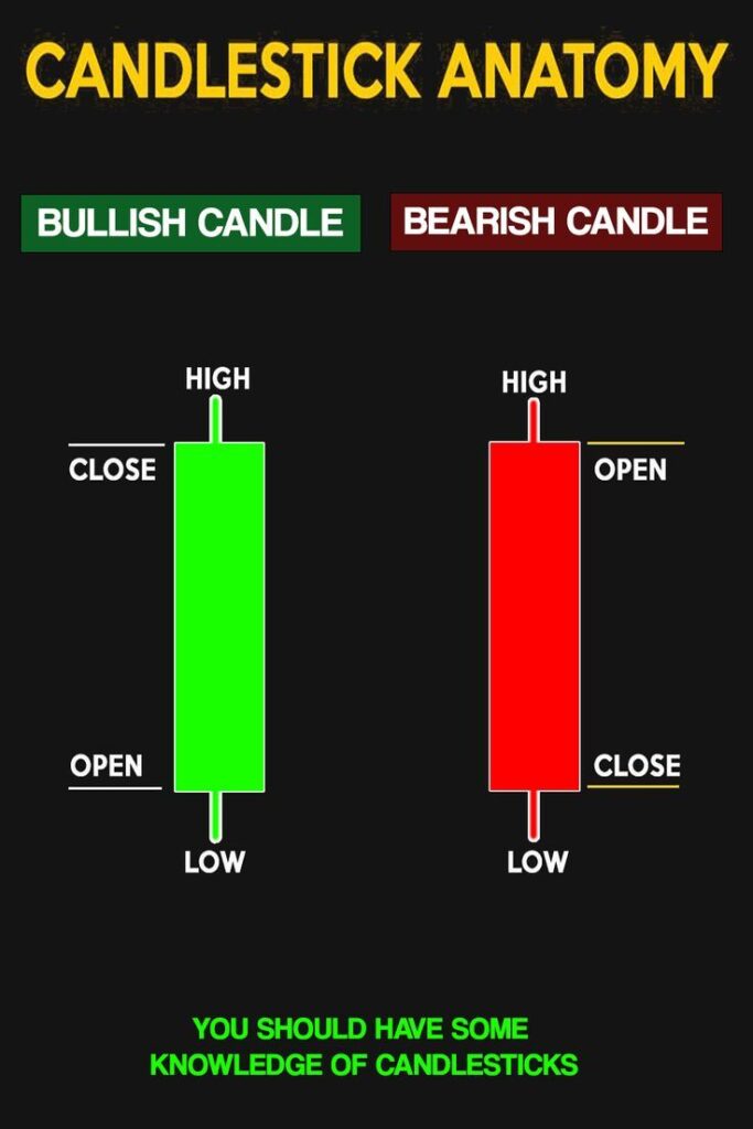
Open: the first price of the time period.
High: the highest price reached.
Low: the lowest point touched.
Close: the final price of that period.
The distance between open and close forms the candle body. The thin lines above and below are called wicks or shadows.
Long bodies show strength, long wicks show rejection or indecision.
Reading candles helps you sense the battle between buyers and sellers in real time.
7. Common Candlestick Patterns
Display of Doji, Hammer, Engulfing patterns on a chart
Candlestick patterns repeat because human behavior repeats. They help identify potential reversals or continuations.
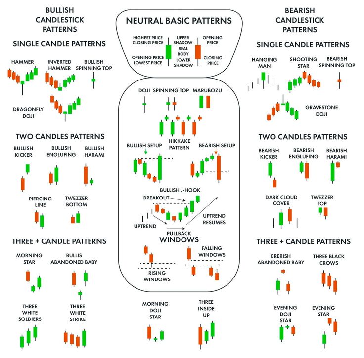
- Doji: open and close are almost equal, showing indecision.
- Hammer: small body with long lower wick, showing a bounce from support.
- Shooting Star: small body with long upper wick, showing rejection from resistance.
- Engulfing Pattern: one candle fully covers the previous one, showing strong momentum.
Patterns are stronger when they appear at important levels or after strong moves.
Trends show strength and momentum. Consolidations show rest and indecision.
Learning to recognize which phase the market is in allows you to choose the right tools and strategies at the right time.
8. Market Phases: Trend and Consolidation
The market never moves in one straight direction. It flows like a wave, shifting between two natural phases: trending and consolidating. Understanding these two behaviors is one of the most important skills a trader can develop.
A trend is a clear directional movement of price. In an uptrend, the market forms a series of higher highs and higher lows. Each push upward breaks the previous high, and each pullback finds support slightly above the last one. This creates a stair-like pattern moving upward.
In a downtrend, the opposite happens. The market builds lower highs and lower lows. Each attempt to rise stops below the previous high, and every drop extends slightly further down, forming a descending staircase.
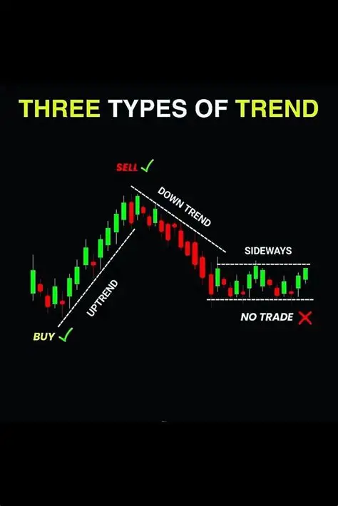
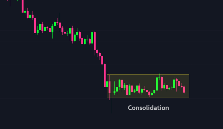
A consolidation happens when neither buyers nor sellers have full control. Price begins to move sideways, trapped within a narrow horizontal range. It bounces repeatedly between a top boundary (resistance) and a bottom boundary (support).
You can imagine this as the market taking a breath after a strong sprint. The energy cools, traders become uncertain, and price oscillates quietly until a new breakout gives direction again.
During a trending phase, you trade with the flow. You enter on pullbacks in an uptrend or on retracements in a downtrend.
During consolidation, you stay patient. You wait for price to break out of the range before committing, because the market is deciding which side will win the next battle.
Trends show strength and momentum. Consolidations show rest and indecision.
Learning to recognize which phase the market is in allows you to choose the right tools and strategies at the right time.
9. Support and Resistance: The Market Boundaries
Support and resistance form the invisible walls that guide the market.
They are price levels that act as turning points — where the market hesitates, reverses, or gathers strength to continue.
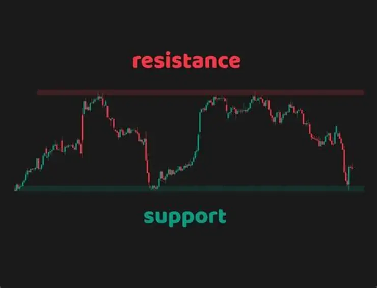
Support is the area where buying pressure is strong enough to stop price from falling further. It is like the floor under the market. Every time price drops near this level, buyers step in because they believe the asset is cheap.
On a chart, support looks like a horizontal zone where candles touch multiple times but fail to break below.
Resistance is the opposite. It is the area where selling pressure stops price from rising further. It acts like a ceiling above the market. When price climbs to this level, sellers take profits and new buyers hesitate, causing price to reverse or pause.
The beauty of these levels is how they change roles. When price finally breaks above resistance, that same level often becomes new support because traders who missed the move try to enter on the retest. Likewise, when price breaks below support, that area can turn into new resistance because traders who bought earlier now look to sell.
Support and resistance levels can appear as flat horizontal zones or as diagonal lines following trends. They represent the collective memory of traders — places where strong reactions happened before and may happen again.
By studying them, you can predict where price might pause, reverse, or accelerate. They are the foundation of chart analysis and the key to timing entries and exits with precision.
10. Trendlines and Channels
Trendlines and channels are the visual skeleton of the market. They help you see direction, rhythm, and structure even when charts look noisy.
A trendline is a straight line drawn across either the lows in an uptrend or the highs in a downtrend. It connects at least two significant swing points and extends into the future.
In an uptrend, the line slopes upward, touching the bottoms of pullbacks. It acts as dynamic support where buyers often return.
In a downtrend, the line slopes downward, touching the peaks of retracements. It acts as dynamic resistance where sellers step back in.
Trendlines tell you where the balance between buyers and sellers is likely to shift. When price touches a trendline and bounces, it confirms that the trend is still healthy. When it breaks through the line decisively, it can signal the start of a new direction.
Channels are pairs of parallel trendlines that contain most of the price action.
Imagine a road with two lanes: the lower line marks where price tends to find support, and the upper line shows where it faces resistance. As price travels between these boundaries, traders can buy near the lower edge and sell near the upper one, until the market finally breaks out.
When a channel breaks, the move that follows is often powerful because the market escapes its previous rhythm.
For example, when an uptrend channel breaks below its lower boundary, it often signals exhaustion and a possible reversal. When a downtrend channel breaks upward, it suggests a change in control from sellers to buyers.
Trendlines and channels give form to what would otherwise look like chaos. They help you read the flow, spot exhaustion, and trade within structure rather than emotion.
11. Chart Patterns: The Market Blueprint
Head and shoulders and triangle chart examples
Chart patterns are visual shapes that repeat and often predict movement.
- Head and Shoulders: signals reversal from uptrend to downtrend.
- Double Top and Double Bottom: shows two failed attempts to break a level.
- Triangles: represent market compression before breakout.
- Flags and Pennants: show pauses inside strong trends.
Patterns work because many traders recognize and act on them together.
12. The Psychology Behind Price Movement
Emotional trader face blended with candlestick background
Charts reflect emotion and human behavior.
- Fear causes sharp drops and large red candles.
- Greed drives quick rallies and strong green candles.
- Uncertainty forms sideways ranges.
When you understand the emotional rhythm behind price, you can react calmly instead of emotionally.
13. Summary
Trader calmly reviewing market analysis
- Charts show the story of price over time.
- Candlesticks express emotion and strength.
- Buyers and sellers create the patterns you see.
- Support, resistance, and trends guide trading decisions.
- Market psychology explains why price moves.
Understanding charts turns trading into skill, not chance.
14. What Comes Next
Computer screen showing indicators overlayed on price chart
Next is Phase 1 Lesson 5 Introduction to Technical Tools and Indicators.
We will explore how moving averages, volume, and momentum indicators support your analysis without replacing your understanding of raw price movement.


